GRS ACCESS ACCESSIBILITY RENOVATIONS
2021
My role
Design lead
UX Designer
Activities
Agile design process plan, designer resourcing, strategy and sprint planning, mentoring and reviews
Wireframes, high-fidelity designs, user testing, user journey flows, competitive research
Platform
Web, responsive web
TL;DR
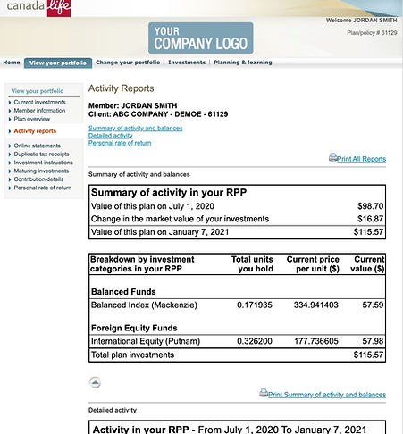
Old GRS Access design

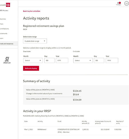
New GRS Access design

Context
Group Retirement Services (GRS) Access is a portal where employees for Canada Life group plans can manage their pensions and other investment plans. For years GRS Access existed by itself, but a new consolidated brand under Canada Life highlighted the need to update the site. There were 14 complicated tools/features of the GRS site the team needed to address.
Importantly, the old site was not accessible to most users. Reskinning the experience was not an option. The information complexity was high and outdated designs and code were not human-friendly. Old tables, dense financial controls, and ancient report formatting made it either cumbersome or literally unusable. It was no surprise the site was not AODA and WCAG compliant and legally needed to be renovated to better accommodate all users.
UX Process
Renovating GRS Access had a straight-forward process that leaned heavily on accessibility consultation and accommodation plans. Ideally we could have also connected to more real users through the discovery stages to clarify the problems and strategy. This was a limitation in how access to users was marshalled within Canada Life.
Planning
-
Defining the business problems
-
Scope alignment
-
Building stories and requirements
Discovery
-
Stakeholder/SME interviews
-
Competitor analysis
-
Current IA and flow mapping
Exploration
-
Mid fidelity designs
-
New user flows
-
Stakeholder reviews
-
Accessibility reviews
-
Usability tests
Details
-
Designing outliers
-
Prototyping and annotation
-
Component contributions
-
High fidelity designs
Key obstacles & resolutions
Development platforms
GRS Access existed in three very different development platforms, each marking a separate phase of improvements over the years. The bottom and oldest layer was no longer being supported corporately (old .Net code). All of the old content and functionality would require life rafts to survive the transition to the new branding and experience.
The newest development platform (Vlocity) introduced a variety of unexpected limitations in the renovations as well. New environment contracts saw a brand new way of working for everyone, and the growing pains added significant complexity.
-
Full project team (UX, Product, Eng) training on Vlocity development and authoring
-
Frequent engineering consultation on possible UX solutions and feasibility through discovery, exploration, and details phases
-
Re-evaluated scope and timelines for feature release based on Vlocity development SNAFUs
Scaling complex features
Some of the most complicated functional areas of the site still only existed in the oldest layers of code and UX. This included important user flows like fund transfers, investment instructions, and activity reports. Previous work had been done for the high level GRS dashboards but the bulk of the complexity had not yet been transitioned and made accessible.
-
Subject matter experts (SMEs) used heavily as partners to identify the inner calculations of the investment tools
-
UX identified improvements to the user flows for key functions and helped evaluate the scale of the remaining work
-
Design system components modified and improved after strong accessibility needs beget changes in design for the project
Mobile finally
The age of mobile first design had not yet dawned when the oldest layers of GRS Access were built. Transitioning the functions and complex data table designs to a mobile responsive experience was necessary to allow broader access to the site. Limits of the new development platform hemmed in our UX solutions.
-
Broad UX alignment sessions on proper accessible and responsive table patterns
-
Detailed reviews with development on scaling up and down Vlocity code components for responsive web
-
Restructured task sequences for complex features, favouring vertical layouts
Mobile responsive designs for complicated features


New statements page marks a significant improvement in development and design

Story highlight
Systems advocacy and leadership
Since the production code for GRS existed across three different platforms there was a lot to be desired in how UX could influence positive experience improvements. The company had a design system, The Nest, which provided a structure that product teams were meant to adopt for new projects. However, the state of GRS Access at the time was complicated and it needed a delicate balance applying the design system guidelines and adhering to limits of the Vlocity development platform.
My UX voice was vital in maintaining our systems standards throughout the project as an advocate, emissary, and federated contributor for the design system myself. I helped the less senior designers supporting this work in finding productive ways to honour the system patterns while development couldn't directly import reusable component code from other product teams. Taking the time to understand and empathize with the engineering group struggling with the new environment created the strong partnerships I needed to fine-tune UX planning. It also meant the team had devs willing to work through complications applying The Nest standards.
Canada Life design system homepage

Story highlight
Agile and design leadership
Canada Life used a homebrew of Agile Scrum for the project team addressing the GRS Access renovations. From UX there were 2.5 resources, including a designer who was shared from another scrum team, but it was without any researchers or strategists - both distinct and spread-thin roles at the time. I wore the designer and strategist hats myself as a lead to keep the GRS work moving forward and flagged when to tag in UXR for analysis support during the exploration phase. Using the knowledge gaps for Vlocity, I was able to separate the designers and myself from the development sprints and added design sprints in advance of build cycles. This also meant I managed the sprint planning and workload for myself and the other designers, coordinating with the Product Owner and shielding my team from the slog of some Scrum ceremonies.
I provided training on WCAG design guidelines to the project team and connected our accessibility experts into the project at every possible moment to consult and support UX-led directions.
Data tables in the new development environment

Overview information was extracted and surfaced sooner in the experience

Outputs & outcomes
The work with GRS Access was ongoing and was planned to continue through into Q4 of 2021 before I moved on from Canada Life. In the meantime, the team was able to successfully renovate the majority of the pages that needed attention. I was able to convince a lot of hesitant business partners to merge the functions of several pages together, and the reception had been very positive. A new set of eyes on an old friend yielded very important improvements.
Key impacts
-
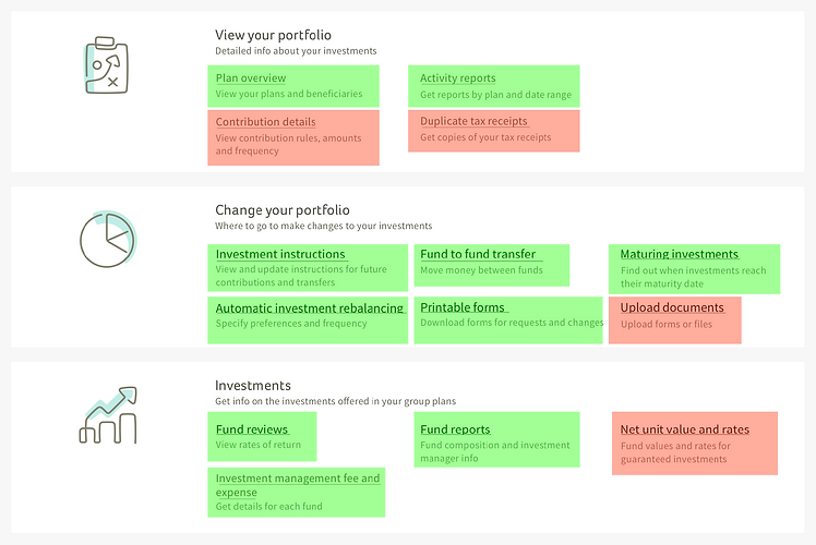
10 of 14 key product features had been rebuilt and launched
-
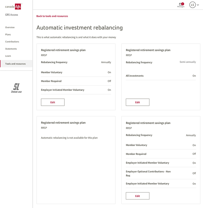
Automatic investment rebalancing users now saw a new overview step, greatly simplifying the IA and experience
-
Any specific fund references anywhere were finally deeplinked to their fund reports, significantly improving access and comparison needs for users
-
Accessibility improvements from GRS Access drove key component and style changes into The Nest design system
-
Responsive table patterns set the standards used in other active product teams
-
Mobile users could finally access the site outside home offices
-
Users with accessibility aids could finally navigate through the site and access documents
Progress through GRS Access was tracking well by mid 2021

Long lists of document downloads, common for investment management
